
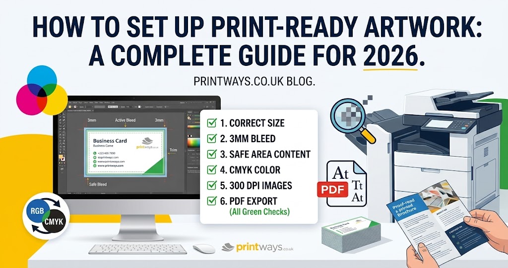
How to Set Up Print-Ready Artwork in 2026: A Complete Guide
If you've ever designed a business card, flyer, brochure, poster or banner and wondered, “Is this actually ready to print?”, you're not alone.
A design can look perfect on your screen and still need a few important adjustments before it can go into professional print production. A missing bleed, low-resolution image, incorrect colour mode or font problem can affect the final result — sometimes in ways that aren't obvious until the finished print arrives.
The good news is that preparing print ready artwork is much easier once you understand the basic principles.
In this guide, we'll walk through the key artwork checks you should make in 2026, from document size and bleed to colour, image resolution, fonts, PDF export and final proofing.
What Is Print-Ready Artwork?
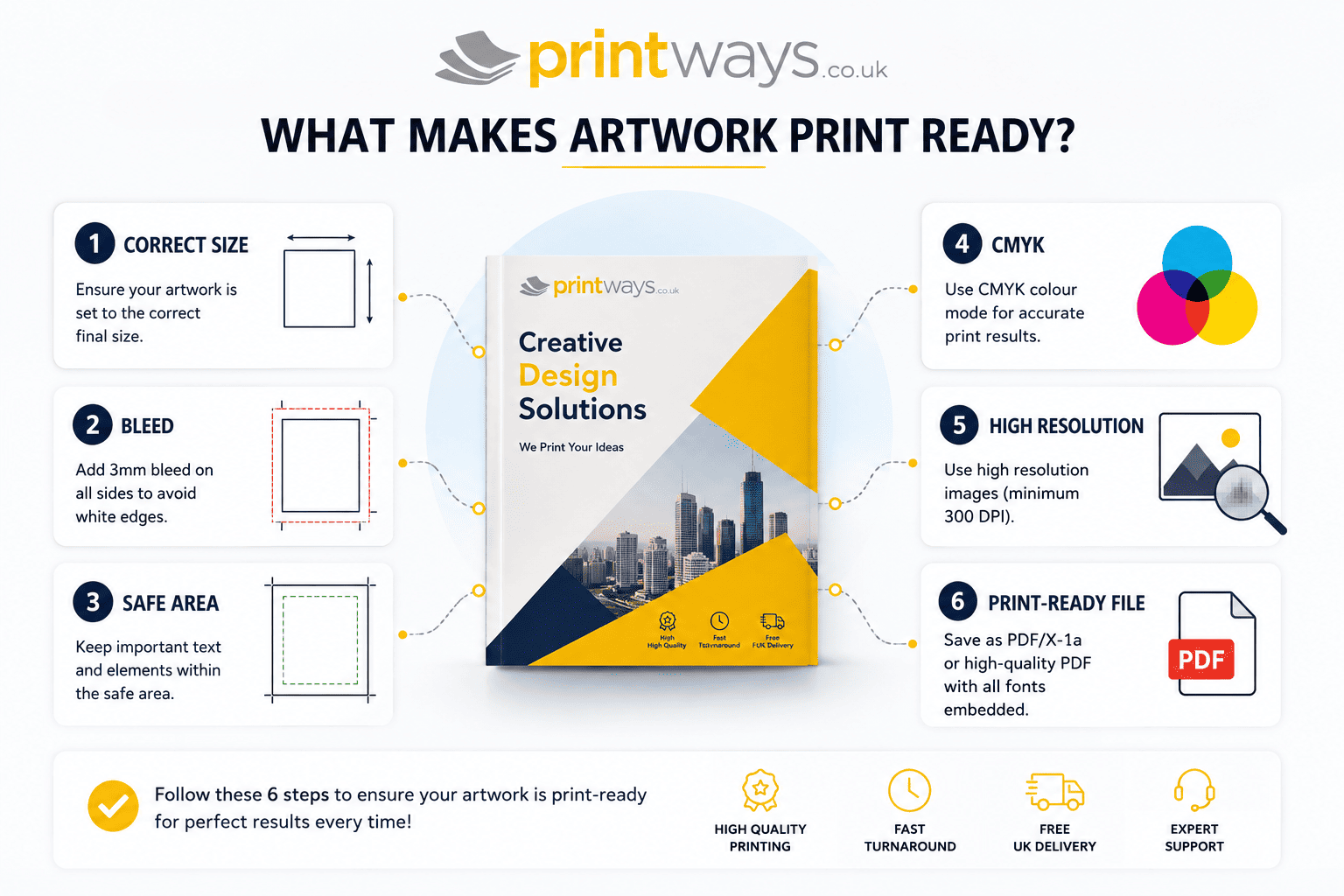
Print-ready artwork is a final design file that has been correctly prepared for a specific printing process and product. It should have the correct finished dimensions, appropriate bleed and safe areas, suitable colour settings, sufficient image resolution, correctly handled fonts and a file format that the printer can process reliably.
The important point is that print-ready does not mean there is one universal specification for every job.
A business card, folded leaflet, exhibition banner and large poster may have different requirements. Always check the artwork specification for the particular product you're ordering before exporting your final file.
1. Start With the Correct Finished Size
Before adding photographs, logos or text, establish the final size of the printed product.
For example, if you're creating a business card that will be trimmed to 90 × 55 mm, your finished document should be based around that final size. If your design runs right to the edge, you'll then need to extend the background or other edge-to-edge artwork into the bleed area.
The same principle applies to:
- Business cards
- Flyers
- Leaflets
- Posters
- Brochures
- Presentation folders
- Stickers
- Banners
Don't simply resize an existing design and assume it is ready for another product. Changing the dimensions can affect image resolution, proportions, text positioning and bleed.
What size should artwork be for printing?
Your artwork should be prepared to the finished size specified for the product, with any required bleed added outside that finished area.
For example, if a printer specifies 3 mm bleed on every edge, a 90 × 55 mm finished design would require artwork extending beyond the trim area.
Always use the printer's template where one is available. Templates can save time and reduce the risk of setting up the page incorrectly.
2. Understand Bleed, Trim and Safe Areas
Bleed is one of the most important concepts in print preparation.
When printed sheets are trimmed, there can be tiny variations in where the cut falls. If your background ends exactly at the trim edge, you could potentially see a thin unprinted line along an edge.
Bleed prevents this.
A common requirement for many small-format printed products is 3 mm of bleed on each edge, although the exact requirement can vary by product and printer.
A simple example
Imagine a business card with a finished size of 90 × 55 mm.
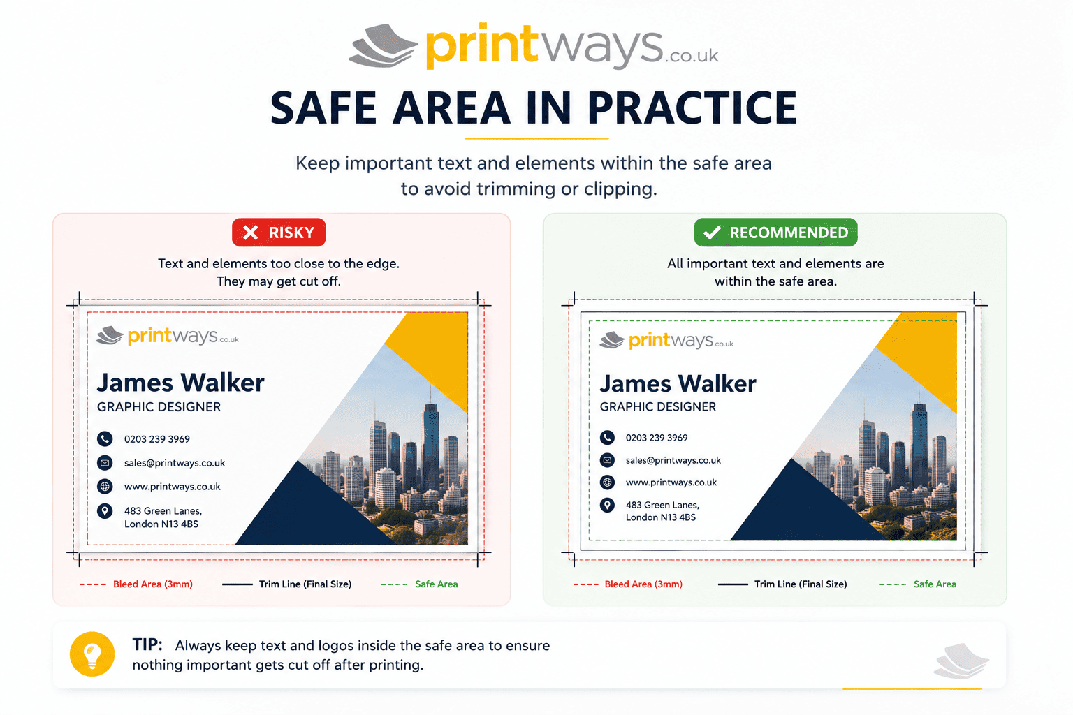
If 3 mm bleed is required on all four sides, the artwork extends beyond the finished size so that the background continues past the intended cutting line.
The important rule is: Backgrounds and images that should reach the edge should extend into the bleed. But important content should not.
Keep logos, headlines, contact details, important graphics, website addresses, and small text comfortably inside the safe area.
How much bleed should I add?
There isn't one number that applies to every printed product.
For many standard printed products, 3 mm is commonly used. However, larger-format products, unusual finishing processes and some bound products can require different bleed or safety margins.
Always follow the artwork specification for the product you're ordering.
3. Keep Important Content Inside the Safe Area
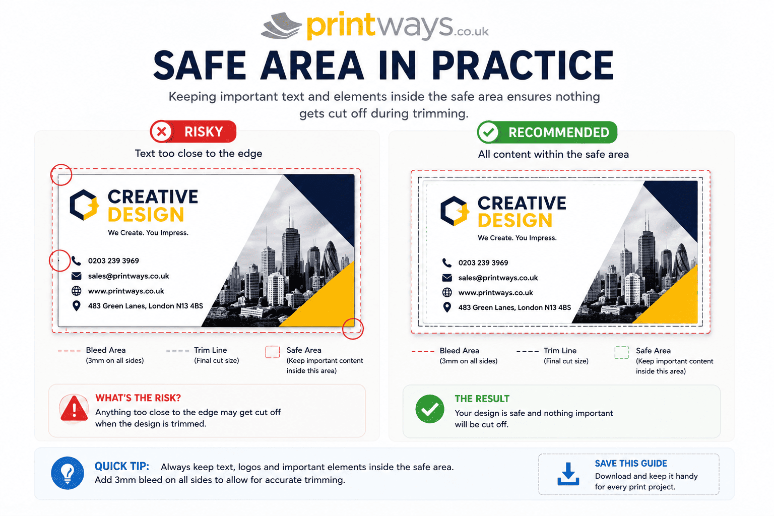
Bleed protects your background artwork. The safe area protects your important content.
If text or a logo sits too close to the edge, even a small trimming variation can make the design look unbalanced or cause important information to be cut.
A useful rule is to give important elements breathing room.
Don't design right up against the trim simply because there is technically space available.
For example, on a business card, your telephone number may technically fit close to the edge, but moving it further inward will make the card easier to read and more forgiving during trimming.
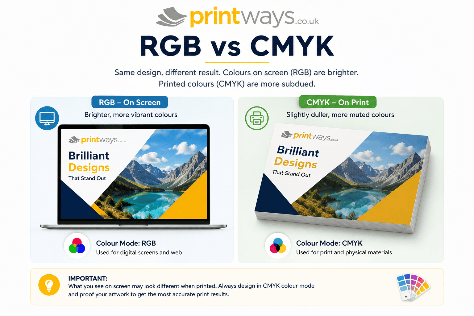
4. CMYK vs RGB: Prepare Colour for Print
One of the most common questions is: Should artwork be RGB or CMYK?
RGB is primarily used for screens, while CMYK is widely used in commercial print production.
If artwork is supplied in RGB, it may need to be converted during the production process. That conversion can change the appearance of some colours, particularly bright or highly saturated colours that are easier to reproduce on a screen than with conventional printing inks.
Preparing artwork appropriately for the intended print process gives you more control over the final result.
Why does printed colour look different from my screen?
Your monitor produces light. Printed material reflects light.
That fundamental difference means a colour that looks extremely bright on a backlit screen may not reproduce exactly the same way on paper.
Colour management, paper stock, inks and the printing process can all influence the final appearance.
For professional work, use the colour settings and profile specified by your printer or print workflow rather than assuming that every job should use exactly the same profile.
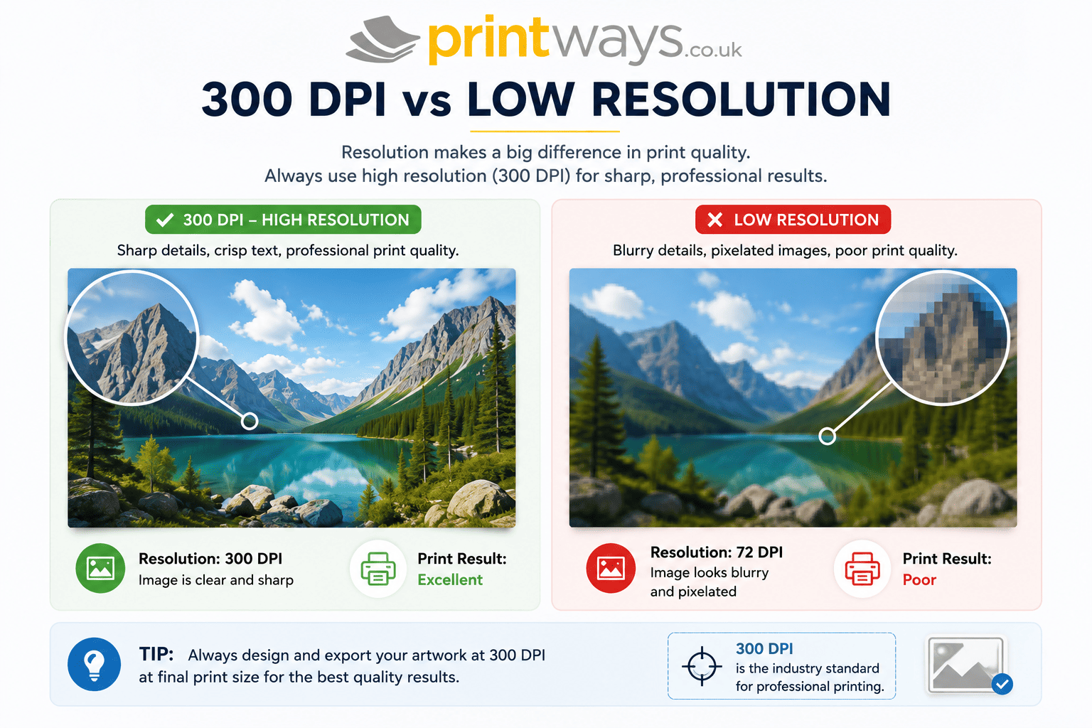
5. Is 300 DPI Still the Standard in 2026?
300 DPI remains a common target for many close-view printed products, particularly when using photographic or raster imagery.
However, it isn't a magic number that applies to every type of printing.
The required resolution can depend on finished image size, viewing distance, printing method, product type, image content, and output equipment.
For example, a photograph on a business card may need considerably more effective resolution than artwork intended for a large-format banner viewed from several metres away.
The key phrase is effective resolution at final print size. A small image that looks sharp on your laptop can become visibly pixelated when enlarged significantly.
A practical test
Before submitting artwork, view your design at approximately its intended physical size.
Ask: Are photographs sharp? Are logos clean? Are fine details visible? Have any images been stretched excessively?
If an image was downloaded from a website, don't automatically assume it's suitable for professional printing.
6. Choose the Right File Format
For many professional print jobs, a print-quality PDF is a dependable choice.
PDF can preserve page dimensions, fonts, vector artwork, images, layout, and transparency information.
Other formats can also be appropriate depending on the artwork and printer. High-quality JPEG files can work well for certain flat artwork or photographic designs, while vector formats such as EPS or native design files may be useful in specific workflows.
The safest approach is not to ask: “What is the best file format for printing?” Instead ask: “What file format does my printer require for this particular product?”
If you're working from Microsoft Word or PowerPoint, exporting to PDF before submission can help preserve the intended layout rather than relying on the printer's computer to reproduce the original document environment.
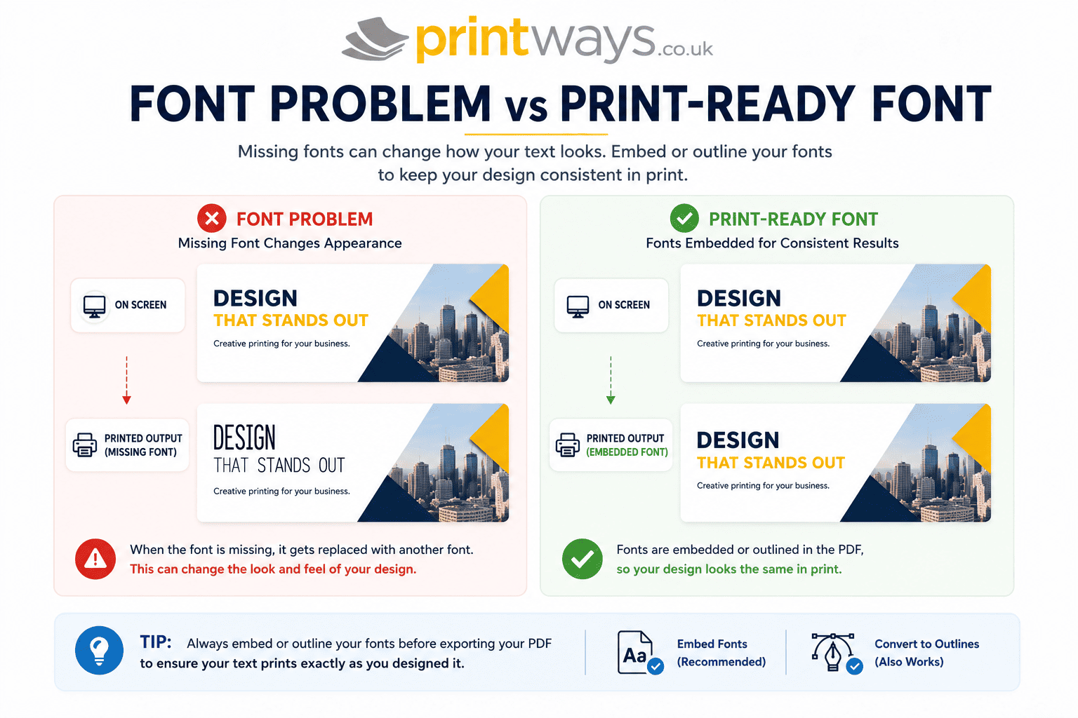
7. Check Your Fonts
Fonts can cause problems when artwork is transferred between computers.
If the printer doesn't have a particular font installed and the font hasn't been properly embedded or converted, the appearance of the artwork can change.
For a final print-ready PDF, fonts should be handled correctly according to the export workflow.
Design applications such as Illustrator and InDesign provide options for embedding fonts in PDFs, while vector artwork can also have text converted to outlines where appropriate.
However, once text has been outlined, it is no longer easily editable as text. So keep an editable master copy of your original artwork before creating the final production file.
8. Use Vector Artwork Where It Makes Sense
Logos, icons, illustrations and simple graphic elements are often best created as vector artwork.
Unlike raster images, vector graphics are constructed mathematically, allowing them to scale without becoming pixelated.
This makes vector artwork particularly useful for logos, icons, line drawings, shapes, typography, and illustrations.
Photographs, meanwhile, are normally raster images and depend on sufficient resolution. A good print file may therefore contain both vector and raster elements.
9. Pay Attention to Black and Small Text
Black isn't always as simple as selecting the black swatch.
For small text and fine lines, a straightforward black treatment can be preferable because using several CMYK inks for tiny elements can make registration more noticeable.
Large areas of black may be treated differently depending on the printing process and the printer's specifications. The important thing is not to assume that a “rich black” formula is suitable for every job.
If you're unsure, follow the printer's colour guidance, particularly for large solid black areas.
Also check small text, thin lines, fine borders, reversed white text, and small logos. These details can look fine on screen but behave differently at print size.
10. Check Transparency, Overprint and Effects
Modern design software makes it easy to add drop shadows, transparency, blending modes, opacity effects, complex gradients, and layered artwork.
These effects can create beautiful designs, but they should still be checked carefully before sending the file to print.
Pay particular attention to overprint settings, especially where black objects overlap other colours. Don't assume that because the artwork looks correct in your design application, every production workflow will interpret every effect identically.
A final PDF inspection and preflight can help identify potential problems.
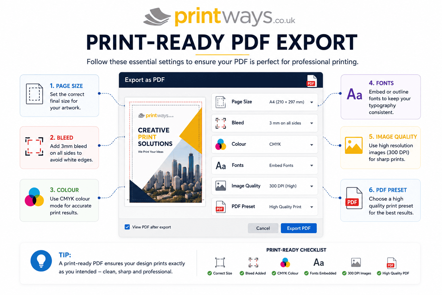
11. How to Export a Print-Ready PDF
Once your artwork is complete, don't simply click “Save”.
Use your application's professional PDF export settings and follow the printer's requirements.
Before exporting, check:
- Final document dimensions
- Required bleed
- Safe area
- Colour settings
- Image resolution
- Fonts
- Transparency
- Page order
- Number of pages
- Correct orientation
Where required, include bleed in the PDF export.
Crop marks may or may not be required. Some print workflows prefer artwork supplied with the correct page dimensions and bleed without customer-added crop marks. Follow the printer's instructions rather than adding marks automatically.
12. Don't Forget to Proof Your Artwork
A final proof is one of the simplest ways to catch expensive mistakes.
Don't just look at the overall design. Check the details. Read every line of text.
Check telephone numbers, email addresses, website addresses, prices, dates, names, social media handles, spelling, and page order.
Then inspect the artwork at actual print size. If possible, print a home proof for checking layout and readability. Remember, however, that a desktop printer cannot necessarily reproduce the same colours, paper characteristics or finish as a professional printing process.
Common Print-Ready Artwork Mistakes
Here are some of the problems worth checking before you upload your file:
- Artwork supplied at the wrong finished size
- No bleed where edge-to-edge printing is required
- Important text placed too close to the trim
- Low-resolution photographs
- Excessive image enlargement
- RGB artwork where CMYK preparation is required
- Missing or incorrectly handled fonts
- Incorrect page orientation
- Incorrect page order
- Unchecked transparency or overprint
- Tiny text that becomes difficult to read
- Spelling mistakes
- Old versions of artwork being submitted
- Exporting without checking the final PDF
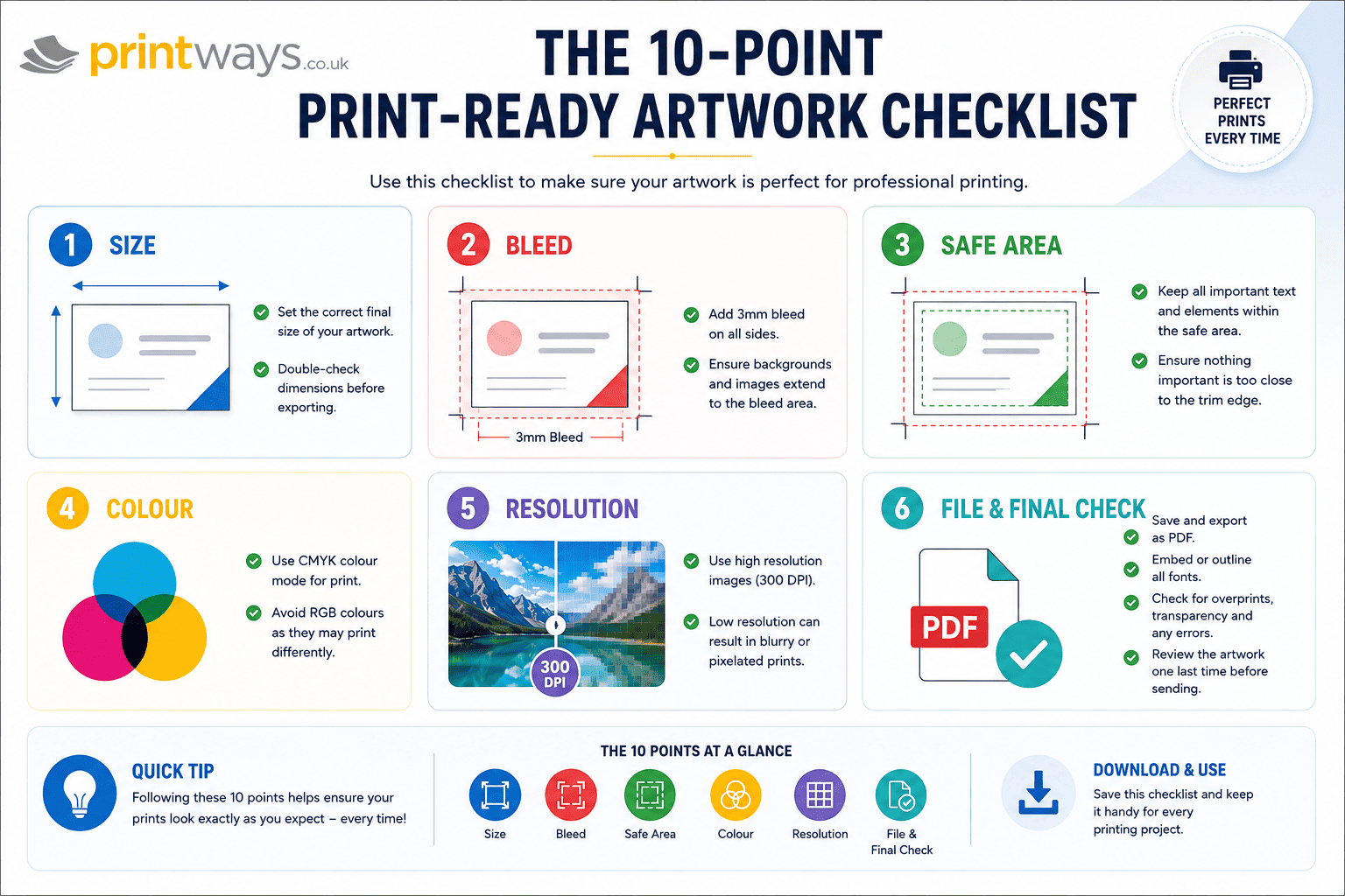
Your Print-Ready Artwork Checklist
Before sending your artwork to print, run through this checklist:
- Correct finished size
- Correct orientation
- Required bleed added
- Important content inside the safe area
- Images are suitable resolution at final size
- Colour mode/profile follows the printer's requirements
- Fonts correctly embedded or outlined where appropriate
- Logos and graphics are sharp
- Transparency and overprint have been checked
- Page order is correct
- Spelling and contact details checked
- Final PDF has been opened and inspected
- Artwork matches the product ordered
- Printer-specific artwork instructions have been followed
Print-Ready Artwork in 2026: What Has Changed?
The tools we use to create artwork have changed dramatically.
Designers now work across professional applications, browser-based design platforms and AI-assisted creative tools. Creating a visually impressive design can be easier than ever.
But automation doesn't automatically make artwork print-ready. An AI-generated image can still be low resolution. A template can still have the wrong dimensions. A design exported from an online platform can still require checking for bleed, colour and file specifications.
The same principle applies to professional design software. The software creates the artwork. The preflight check makes sure the artwork is ready for production.
In 2026, that final human check remains important.
Final Thoughts: Get Your Artwork Right Before You Print
Preparing print ready artwork doesn't have to be intimidating.
Start with the correct finished size. Add the required bleed. Keep important content safely inside the trim. Check colour, resolution and fonts. Export the appropriate file format and, most importantly, inspect the final file before submitting it.
The exact specifications can vary depending on the product, finishing method and printing process, so always check the requirements for your specific job.
If you're preparing artwork for an upcoming print project and aren't sure whether your file is ready, Printways.co.uk can help you understand what is required before production begins.
Good artwork preparation means fewer surprises, a smoother production process and a finished print that looks much closer to what you intended on screen.
Frequently Asked Questions
What is print-ready artwork?
Print-ready artwork is a final file prepared to the printer's specifications, including the correct size, bleed, safe area, colour settings, image resolution, fonts and file format.
How much bleed should I add to artwork?
A 3 mm bleed is common for many standard printed products, but it isn't universal. Some large-format or specialist products may require different specifications. Always check the requirements for the product you're ordering.
Is 300 DPI enough for printing?
300 DPI is a common target for many close-view printed products, particularly photographic images. Large-format printing may use different effective resolutions because viewing distance and production methods vary.
Should I use RGB or CMYK for print?
CMYK is widely used for commercial printing, but the correct colour workflow depends on the printer requirements. Follow the colour specification supplied for your particular job.
What is the best file format for printing?
A correctly prepared PDF is commonly used for professional print submission. Depending on the job, high-quality JPEG, EPS or other formats may also be accepted. Always follow your printer's file requirements.
Do I need crop marks?
Not necessarily. Some printers do not require customer-supplied crop marks when the artwork has been supplied at the correct size with the required bleed. Follow the specific artwork instructions for your job.
Can I print artwork created in Canva?
Yes, designs created in browser-based tools can be used for professional printing, provided the exported file meets the printer's requirements for size, bleed, resolution, colour and file format.
Is AI-generated artwork ready to print?
Not automatically. AI-generated artwork should still be checked for resolution, dimensions, colour, typography, image quality and the printer's technical requirements before submission.
Marcus Hayes
Verified Print ExpertSenior Prepress & Commercial Print Specialist • Printways UK
Commercial print and prepress technical specialist with over 14 years of industrial lithographic, digital print, and finishing experience. Marcus oversees technical print specifications, file pre-flight inspection, and colour management standards at Printways.